This is something that’s been driving me crazy for a while now because I think that someone in some PR department somewhere is really dropping the ball on this one.
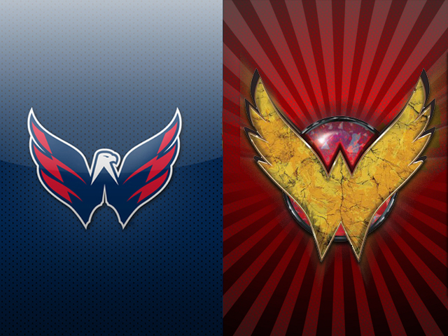
So the Washington Capitals have this “new” logo. I use quote marks because I’m not really sure how new it is…all I know is that I just started noticing it about a year ago. It’s actually a great logo:

Whoever designed this did a fantastic job of integrating all the major elements into one attractive design. You’ve got the team’s patriotic color scheme (on an eagle, of course, because what could be more patriotic than an eagle?), with the blue on the wings delineating the outline of a “W” for Washington while also forming the baseline for the eagle’s neck ruff and wings, with nice bolts of red for the wing tips. Then there’s the cut-out of the Capitol dome to both form the bottom part of the W and to represent the team’s name, Capitals.
I love this logo. Mainly, though, I love this logo because I think it would make an awesome Wonder Woman logo. Don’t you think?
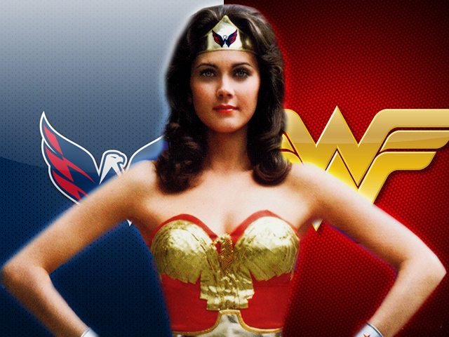
Here, this is the Caps logo and the current Wonder Woman logo, together:

Not exactly the same, but pretty complimentary. Or how about this? This is the Wonder Woman logo designed for the recent “Flashpoint” series:

That’s more like it! Look at how similar these designs are!!
So what’s the missed marketing opportunity? Well, Lynda Carter lives in the Washington, D.C. area. Who wouldn’t want to see her don the old red, white, and blue one more time for the just American cause of…selling hockey tickets?
Anyone? Just me? Fine. Be that way. You’re all just jealous because you didn’t think of it first…
