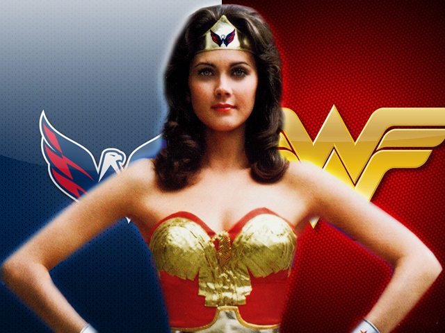
See, denizens? I told you that, for my next reviewed book, it would be imperative that the artists made the character look like her Hollywood counterpart, didn’t I? Well, that they did…and I couldn’t be more delighted by the end result.
I admit that I was incredibly concerned when I first learned that DC Comics was going to do a comics series based on Lynda Carter’s television portrayal of Wonder Woman. Why? Because they’d assigned Marc Andreyko to pen the stories. Andreyko is the putz who destroyed Batwoman with a story line that turned disturbing in such a way that I didn’t even bother buying the final collection of her previous run. To be honest, if it weren’t for the fact that DC Comics has decided to give Batwoman a new go with her own Rebirth series, I probably wouldn’t have bothered with this collection at all. I can hold a grudge like no one’s business.
Wonder Woman ’77 seems to be precisely what Andreyko needed to redeem himself (at least to me) and what he excels at creating. I was pleasantly surprised by how reminiscent the stories were to those Wonder Woman episodes that I loved so much when I was a kid (and still love, thank you very much). Not only were they reminiscent, but they were so respectful and reverential of that show. Lynda Carter’s portrayal of Princess Diana of Paradise Island was so important and influential to so many people that to do her any injustice would have been unforgivable to many fans. I’m delighted to report that, in my humble opinion, this collection paid her the respect and honor she deserves.
Also, the artwork was so impressive and such a pleasure to behold:

Artists Drew Johnson, Matt Haley, Richard Ortiz, Jason Badower, and Cat Staggs provided penciling and coloring that made Diana Prince and Wonder Woman shine in every single panel. And Steve Trevor be Steve Trevor, in all his Waggonerian glory. Plus, the celebration of all things 70s throughout the artwork and stories inspired quite a bit of uncontrollable smiling and laughter from me. That’s why they note in the collection’s title that this is Wonder Woman as she appeared in the 1977 season of her show. ABC dropped the show after one season, which they had set during World War II. When CBS then picked up the show for its second season, they decided to move it to modern times. I don’t know if DC Comics plans on doing anything in this series that might hearken back to Diana Prince’s time in the WAVES and the war, but I’m more than happy to get my paws on the next collection to find out.
Final Verdict: I’m pretty sure I just let that cat out of the bag. Again, not earth-shattering storytelling in any way, but so respectful and so fun to read and enjoy. Also, I do believe that DC Comics has done something similar for Adam West’s Batman ’66…I also believe that the next collection of Wonder Woman ’77 comics might even cross streams with that series. Oh, and don’t even get me started on the fact that they’ve just started another crossover with Lynda Carter’s Wonder Woman in which she gets to team up with Lindsay Wagner’s Bionic Woman. Seriously, my heart might explode from all the love that I have for both these characters when I finally get my hands on that collection.


